Start Your Purchase & Customer Portal
DRH wanted to continue to improve the customer experience by allowing users ti start the purchase right from their computers. My role in this project was to make improvements to the current user profile, redesign the community pages for inital purchases and conceptualize a portal that will could hold a buyer’s documents.
To protect the privacy of the company, I’ve limited and omitted some information and images in this case study.
Company
D. R. Horton
My Role
Research, UX Design, Web Design, Wireframes
Tools
Adobe Photoshop, Adobe Illustration, Adobe XD
Team
Indiviual, DevOps Team
Understanding
The Challenge
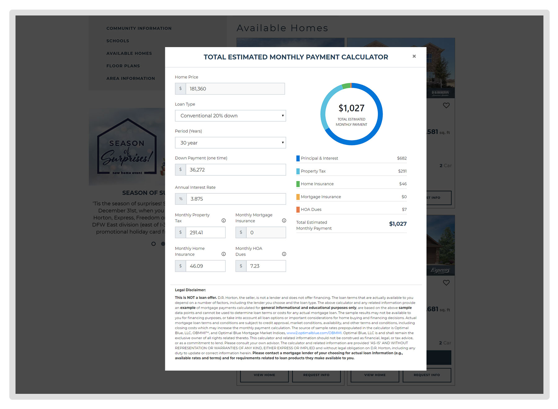
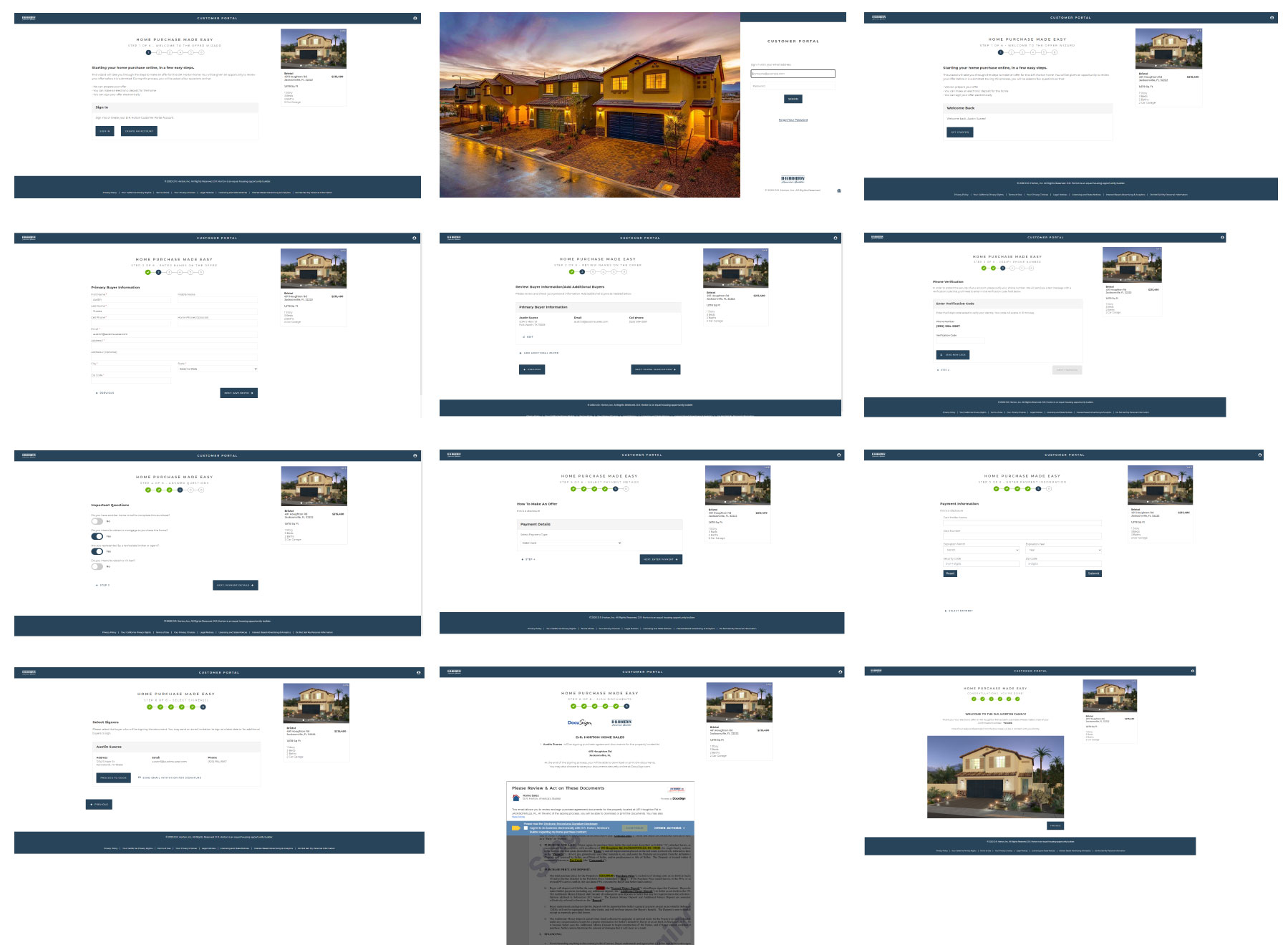
Create a feature that would enable buyer’s to start their home purchase online, estimate the purchase cost and save their contracts and documents.
The start of this UX project started kicked off with a major constraint:
- An immediate turn over ‒ there was no projected timeline or due date but stakeholders wanted this to be a project that would roll out immediately. I would work on this daily until it would be handed over to the DevOps and IT teams
Discovery & Observations
Research
Since I conducted the initial user research, I was very familiar with our users and the pain points that they would face when visiting the site. However, there was no testing completed in the customer profile.
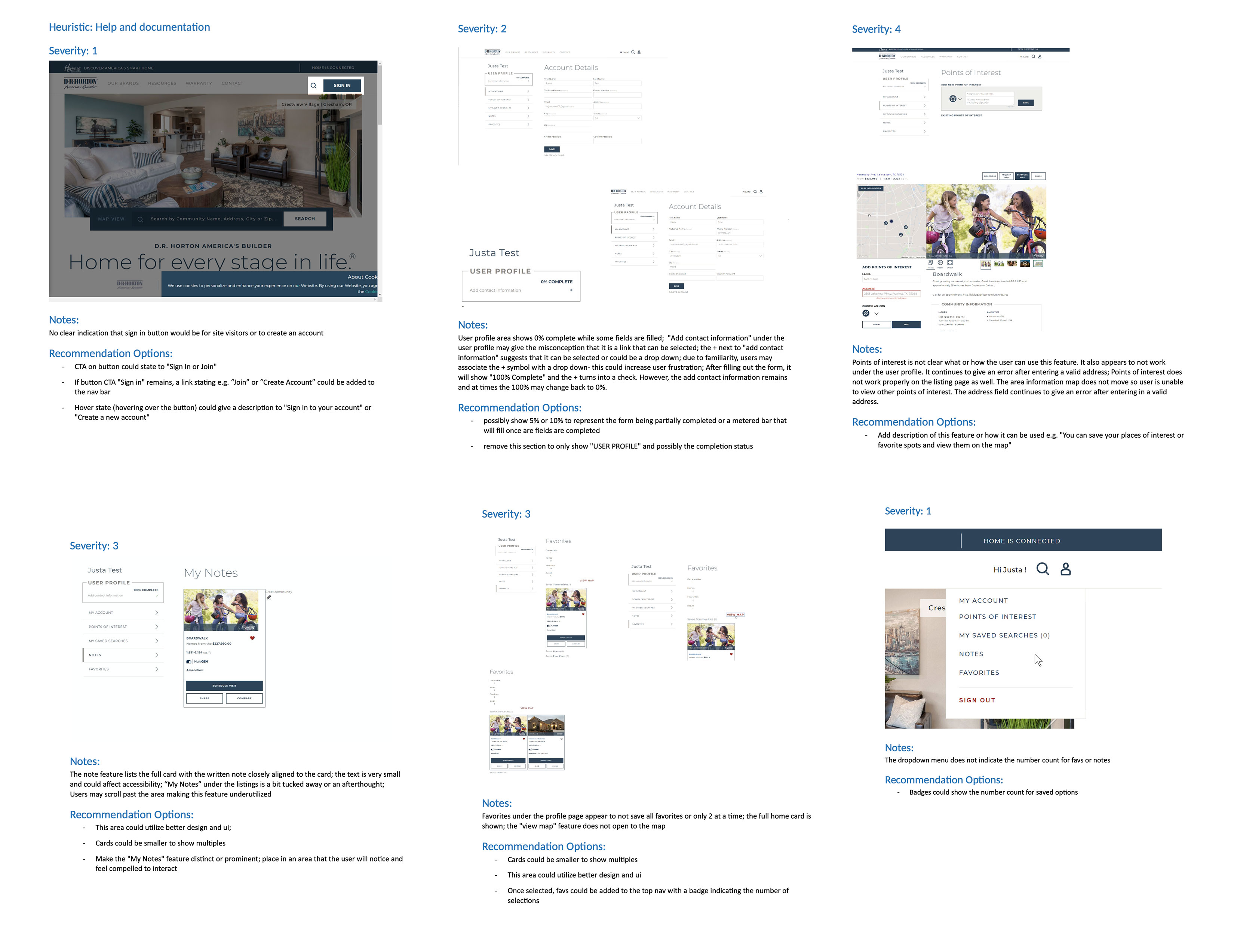
I started my research in the portal with a heuristic evaluation and competitive analysis:

- The current user profile needed several updates
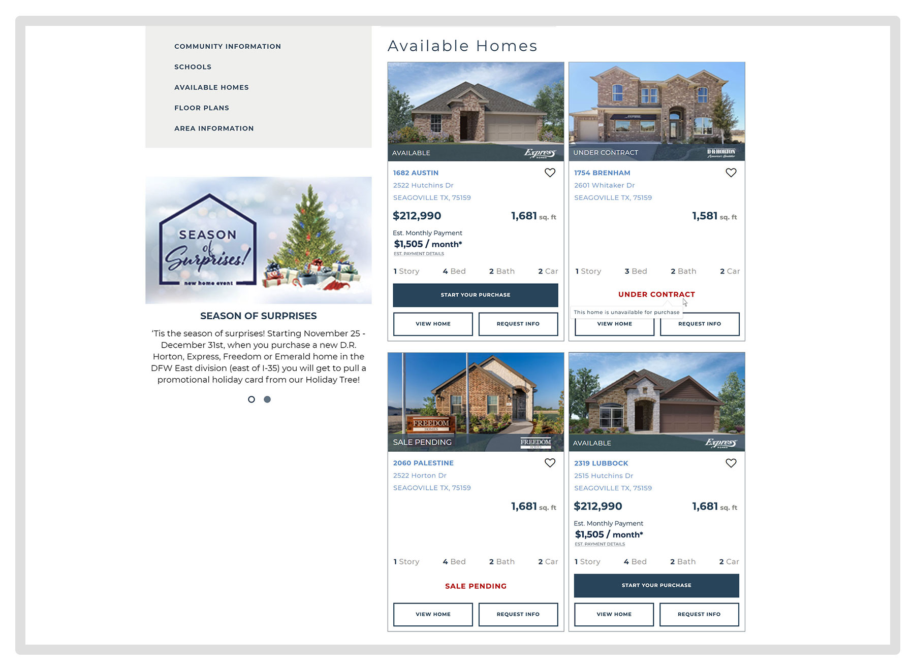
- The current “estimate payment” link did not allow users to calculate their payments online
- The current profile feature would not be able to hold customer’s private documents
Iterations
There were several different ideas about what the site should do and how users can successfully complete tasks. I explored them all, varying in depth from low-fi sketches to mid-fi wires. The wireframes helped me better assess what functionalities and components were working and what wasn’t working based on user and team feedback. From there, I continued working on iterating the wireframe to include new options & features. I went through numerous rounds of feedback with teammates and stakeholders and soon, new challenges would present themselves. This would include how the standing inventory can be accessed by users and limited features that the dev team would be able to develop with the existing design.
After countless explorations and iterations, we decided to move forward with a direction that was simple yet gave several new options to our users.


Final Deliverables
Solutions & Outcomes
We were able to improve the existing mobile experience by honing in on areas, along with the features and options that our users would be familiar with when it comes to searching for homes online. Here are a few areas that we enhanced:
Communication
- Making our search clear, direct and intuitive
- Updating the communities results page to be clear and direct with button call outs and a number of results badge
- Creating differentiation between floor plans and available homes along with sort and filter options
Convenience
- Giving users the opportunity to go directly to what they want- find out what available homes are listed in a specific community or view all the available homes in any given area. Giving users the opportunity to explore areas they may not have initially considered
Aesthetics
- Created the map view to be familiar and markers that are easily identifiable to increase engagement
Efficiency
- Taking away the stress by switching the infinite, horizontal scroll to a “load more” option and adding a map option plus sort and filter options to the results page
- Add pagination to areas that will have a horizontal scroll
- Lessen scrolling by showing only the important information at the top of the page, giving users a direct view to the homes and floor plans. Additional information was added to an accordion menu under the listings
Lessons Learned
Involve developers early on.
This one’s probably the easiest to agree on and something others have said time and again. While I had plenty of big ideas initially, I didn’t take into account that our development team would also have their own set of limitations and constraints. Communication was key in understanding their capabilities early on. If they were to see what we were thinking about during the ideation process, we would’ve been able to eliminate some ideas early on.
Improvements to my own process.
Things may become a little scattered at times when working with other teams, but spending the time to understand their processes and even timelines helped to improve mine. Creating and improving the UX process to combine SCRUM meetings, breaking down design strategies and timelines truly helped to streamline my day-to-day work. This was one of my greatest takeaways from this project.
◀︎ PREVIOUS PROJECT
ABOUT ME ▶︎